pip
WS Benefactor
Berkshire, UK
Posts: 6,176 
|
Post by pip on Jan 29, 2020 5:55:48 GMT -8
A good buddy of mine timeonthewrist has just snagged one of the new colour range of Alpinists, the black faced SPB117 which does look rather nice! He pointed out to me the change in Seiko applied logo, so I thought I'd do a quick and dirty comparison with my SARB017 and my SARB035, only using pics though. The new logo appears to be thinner and taller (two things I wish I was sometimes). I've not seen the two watches side by side yet but hopefully will be meeting Rich on Monday where we can compare them and possibly take a more controlled photo set. It got me to thinking about Seiko logos and if there is an image catalogue somewhere of the different fonts of real ones? Oh for the time and the watches to make such an image bank myself! Here are the quick and dirty comparison pics... 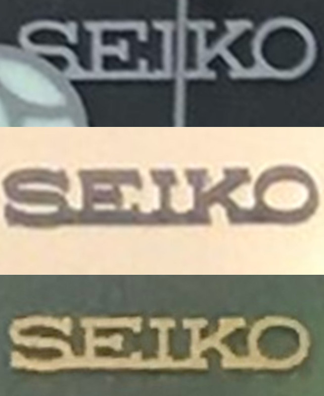  |
|
|
|
Post by huangcjz on Jan 29, 2020 7:18:05 GMT -8
Yes, they started using larger logos several years ago now. Compare the SEIKO logos on the SARB033/SARB035 to the ones on the SARY055/SARY057, and the ones on the SARB065 to the ones on the SRPB43. The SDGM001 and SDGM003 have the larger logo too, so it must date from at least when they were introduced or perhaps before then. I don’t know if any earlier models than them have it, too.
|
|
pip
WS Benefactor
Berkshire, UK
Posts: 6,176
|
Post by pip on Jan 29, 2020 8:44:11 GMT -8
Yes, they started using larger logos several years ago now. Compare the SEIKO logos on the SARB033/SARB035 to the ones on the SARY055/SARY057, and the ones on the SARB065 to the ones on the SRPB43. The SDGM001 and SDGM003 have the larger logo too, so it must date from at least when they were introduced or perhaps before then. I don’t know if any earlier models than them have it, too. 7dfe79adc2f0 |
|
|
|
Post by huangcjz on Jan 30, 2020 21:58:31 GMT -8
It seems that even in the vintage era they varied, and looking at various watches that I have, I think the difference is not just due to changing in one direction from one type to another over time - here are two examples which hopefully illustrate the difference: What I usually think of as the SEIKO logo, which is stretched horizontally, like that on the SARBs - this watch is from May 1976:  A taller SEIKO logo, most obvious from the more circular shape of the "O", but also quite apparent in the "S" and the "E", like that on the PROSPEX Alpinist. The top curve of the "S" also comes above the straight line formed by the top of the other letters, much more noticeably so than on the SARBs, and unlike on the PROSPEX Alpinist or Grand Quartz. This watch is from April 1975:  Although one of these watches is Suwa and the other is Daini, and one is quartz and the other is mechanical, I also don't think that it's a Suwa vs. Daini difference or a quartz vs. mechanical difference, though I've only taken a quick rather than very thorough look at my watches, and hence can't say for sure. Of course, neither of these factors would be the case for the difference in modern Seikos anyway, since all mechanical modern Seikos are made by SII, formerly Daini. I don't know if it's a factory difference, I'd have to look at all the factory codes - but I doubt that it'd be possible to tell from looking at the watches directly themselves, since even if the cases are made in different factories as discernible from the codes (the Grand Quartz is from factory code J, whereas the LM Special is from factory code M), the dials would probably be made in different factories from the cases anyway. |
|

