REVIEW: The Time Sonar Re-edition, SRPJ41 (and 43, 45, 47)
Sept 23, 2022 17:06:47 GMT -8
siralan, SteveX, and 6 more like this
Post by dapellegrini on Sept 23, 2022 17:06:47 GMT -8
Thank you inboost for finding (and sharing) this watch's sales link, and SteveX for bringing it to my attention (and being a fellow owner of this model)! I put the order through in the evening and it was sent via Fedex the next day. The retailer confirmed via email that an adult signature would be required for delivery. No issue there.
The following are my first impressions, opinions and ramblings, blow by blow…
-10 (minus ten) minutes
Fedex rings the bell, well before noon. I was expecting them, so all is good. Still, this requires careful maneuvering to exit the front door without the dog in tow. He (the dog) has bad intentions for the delivery guy.
Once safely outside - and with the dog going a little nuts on the other side of the door - the Fedex guy asks me for my drivers license…. Seriously? I don’t have shoes on, and am lucky to be wearing a shirt! I know - I was expecting him, of course I was wearing a shirt … Still.
After a short negotiation, we agreed that my birth date would suffice, and he intimates how curious he is about what could possibly be so important in this box. Note to self, park cars in garage from now on. JK (this is a $440 watch!)
0 (zero) minutes
This is a nice shipping job. Well done [nameless] retailer! Outer box and packing is top shelf. Clean shipping box, quality packing tape and padding materials.


2 minutes
What a nice display box. Zodiac, take note, this watch is a lot less than your cheapest, and in another league, in terms of presentation. #Srsly.

I appreciate that the retailer broke the rules for me here - including the outer sleeve


5-minutes
My direct experience with modern Seikos is very limited, essentially to this one, and the new-to-me Turtle in the WRUW thread today. While this is not as big as my Turtle, it is more substantial than I had anticipated. I believe this maybe the SKX007 case - it certainly appears so from the photos I have seen to compare the two. It looks a bit underwhelming sitting there in the box, and even in press photos, but once you have it in hand, it definitely has presence. Perhaps it is the thickness, hmmm? My calipers say 13.6mm.
I feel like little red riding hood arriving at grandma’s house. My what a large crown you have grandma. And what a large bezel, (profoundly) deep dial, and thick case you have…
10 minutes
The more time I spend with this watch, the more obvious it is to me that this is a proud ransom letter addressed to Seiko days past. It very much embraces that retro feel, and in equal measure feels like a nod to seiko mod-culture. Here’s the paper insert that notes the origin of several of the parts mish-mash we are looking at (shared previously by SteveX ):

And the other side appears to be a poster or artwork from OSUKE KAWAMURA

The "designer" of this watch, OSUKE KAWAMURA, is a "collage" artist, so it makes a lot of sense that this watch is an intentional mix-master. Collaborations are hot right now in the watch space (moon-swatch anyone?). Here's a little bit more about the artist:
mct.tokyo/en/collections/kosuke-kawamura
15 minutes
Here we have your standard, lower-shelf, cotter-pin bracelet, brushed on all sides. Easy enough to size, and more comfortable than most of my vintage Seiko bracelets, but not really trying to strike above its price range here. Clearly this watch is all about the dial (and case back). The signed clasp is a nice touch though.


I needed to remove 5 links to fit my dainty 16.5 cm wrist.
30 minutes
I can't seem to capture the depth of the dial in photos. Its like if you removed the entire thickness of the bezel, then attached a crystal there, it would still leave clearance for the hands - at least that how it seems in person. The watch wears nicely, if a bit thick.


And a quick look at the translucent case back


1 hour in
Since I also have a Turtle laying around, I thought a quick comparison might be interesting. In person the Turtle is heavier and larger. I suspect the unpopular-to-some Prospex branding is supposed to be a step (or half step) above the Seiko 5, but I could be wrong. The Turtle measures a few fractions of a mm thinner than this Time Sonar, but larger in every other dimension.

Note the case on the Time Sonar is neither polished, nor brushed. It's not really a blasted finish either - more like just a "worn look", but new out of the box like that:


The Time Sonar is thin on lume - just the hour and minute hands + the pip on the bezel at 12-o'clock.


Final “first” impressions
I’m a sucker for unique watches. I like them from different countries of origin, built for different purposes, and in different shapes and colors. In my collection you will not find a bunch of submariner look-a-likes. If I was to be harsh, I would say that this new “Time-Sonar” rides a fine line between being playful/colorful and feeling a bit cheap/childish. I believe it avoids the later for two reasons - (1) its loud visual features are direct callbacks to notable Vintage Seiko models and (2) Seiko is known (and perhaps loved) for their oddball shapes and colors from the 1970’s (or there about) - and again, this is a strong play in that arena - see point #1. Still, I am not sure, or rather, I am very sure, that this will NOT be my go-to when heading out to dinner at a Michelin-starred restaurant. But for all things casual, this is a winner in my book.
Here's a quick shot of the new Time Sonar next to a couple vintage Seikos (in need of repair) that I feel have a similar vibe and color scheme:

I don't have examples of the original time sonars, or a vintage rally for additional side-by-sides, but those would also show a strong resemblance.
In summary - if you don’t like the look of the watch in photos, you won’t like it in person. If you find yourself drawn to it in photos, there is a good chance you will like it even more on your wrist. I don’t think this one leaves a lot of middle ground, which I find refreshing.


The following are my first impressions, opinions and ramblings, blow by blow…
-10 (minus ten) minutes
Fedex rings the bell, well before noon. I was expecting them, so all is good. Still, this requires careful maneuvering to exit the front door without the dog in tow. He (the dog) has bad intentions for the delivery guy.
Once safely outside - and with the dog going a little nuts on the other side of the door - the Fedex guy asks me for my drivers license…. Seriously? I don’t have shoes on, and am lucky to be wearing a shirt! I know - I was expecting him, of course I was wearing a shirt
 … Still.
After a short negotiation, we agreed that my birth date would suffice, and he intimates how curious he is about what could possibly be so important in this box. Note to self, park cars in garage from now on. JK
 (this is a $440 watch!)
0 (zero) minutes
This is a nice shipping job. Well done [nameless] retailer! Outer box and packing is top shelf. Clean shipping box, quality packing tape and padding materials.


2 minutes
What a nice display box. Zodiac, take note, this watch is a lot less than your cheapest, and in another league, in terms of presentation. #Srsly.

I appreciate that the retailer broke the rules for me here - including the outer sleeve


5-minutes
My direct experience with modern Seikos is very limited, essentially to this one, and the new-to-me Turtle in the WRUW thread today. While this is not as big as my Turtle, it is more substantial than I had anticipated. I believe this maybe the SKX007 case - it certainly appears so from the photos I have seen to compare the two. It looks a bit underwhelming sitting there in the box, and even in press photos, but once you have it in hand, it definitely has presence. Perhaps it is the thickness, hmmm? My calipers say 13.6mm.
I feel like little red riding hood arriving at grandma’s house. My what a large crown you have grandma. And what a large bezel, (profoundly) deep dial, and thick case you have…
10 minutes
The more time I spend with this watch, the more obvious it is to me that this is a proud ransom letter addressed to Seiko days past. It very much embraces that retro feel, and in equal measure feels like a nod to seiko mod-culture. Here’s the paper insert that notes the origin of several of the parts mish-mash we are looking at (shared previously by SteveX ):

And the other side appears to be a poster or artwork from OSUKE KAWAMURA

The "designer" of this watch, OSUKE KAWAMURA, is a "collage" artist, so it makes a lot of sense that this watch is an intentional mix-master. Collaborations are hot right now in the watch space (moon-swatch anyone?). Here's a little bit more about the artist:
mct.tokyo/en/collections/kosuke-kawamura
15 minutes
Here we have your standard, lower-shelf, cotter-pin bracelet, brushed on all sides. Easy enough to size, and more comfortable than most of my vintage Seiko bracelets, but not really trying to strike above its price range here. Clearly this watch is all about the dial (and case back). The signed clasp is a nice touch though.


I needed to remove 5 links to fit my dainty 16.5 cm wrist.
30 minutes
I can't seem to capture the depth of the dial in photos. Its like if you removed the entire thickness of the bezel, then attached a crystal there, it would still leave clearance for the hands - at least that how it seems in person. The watch wears nicely, if a bit thick.


And a quick look at the translucent case back


1 hour in
Since I also have a Turtle laying around, I thought a quick comparison might be interesting. In person the Turtle is heavier and larger. I suspect the unpopular-to-some Prospex branding is supposed to be a step (or half step) above the Seiko 5, but I could be wrong. The Turtle measures a few fractions of a mm thinner than this Time Sonar, but larger in every other dimension.

Note the case on the Time Sonar is neither polished, nor brushed. It's not really a blasted finish either - more like just a "worn look", but new out of the box like that:


The Time Sonar is thin on lume - just the hour and minute hands + the pip on the bezel at 12-o'clock.


Final “first” impressions
I’m a sucker for unique watches. I like them from different countries of origin, built for different purposes, and in different shapes and colors. In my collection you will not find a bunch of submariner look-a-likes. If I was to be harsh, I would say that this new “Time-Sonar” rides a fine line between being playful/colorful and feeling a bit cheap/childish. I believe it avoids the later for two reasons - (1) its loud visual features are direct callbacks to notable Vintage Seiko models and (2) Seiko is known (and perhaps loved) for their oddball shapes and colors from the 1970’s (or there about) - and again, this is a strong play in that arena - see point #1. Still, I am not sure, or rather, I am very sure, that this will NOT be my go-to when heading out to dinner at a Michelin-starred restaurant. But for all things casual, this is a winner in my book.
Here's a quick shot of the new Time Sonar next to a couple vintage Seikos (in need of repair) that I feel have a similar vibe and color scheme:

I don't have examples of the original time sonars, or a vintage rally for additional side-by-sides, but those would also show a strong resemblance.
In summary - if you don’t like the look of the watch in photos, you won’t like it in person. If you find yourself drawn to it in photos, there is a good chance you will like it even more on your wrist. I don’t think this one leaves a lot of middle ground, which I find refreshing.


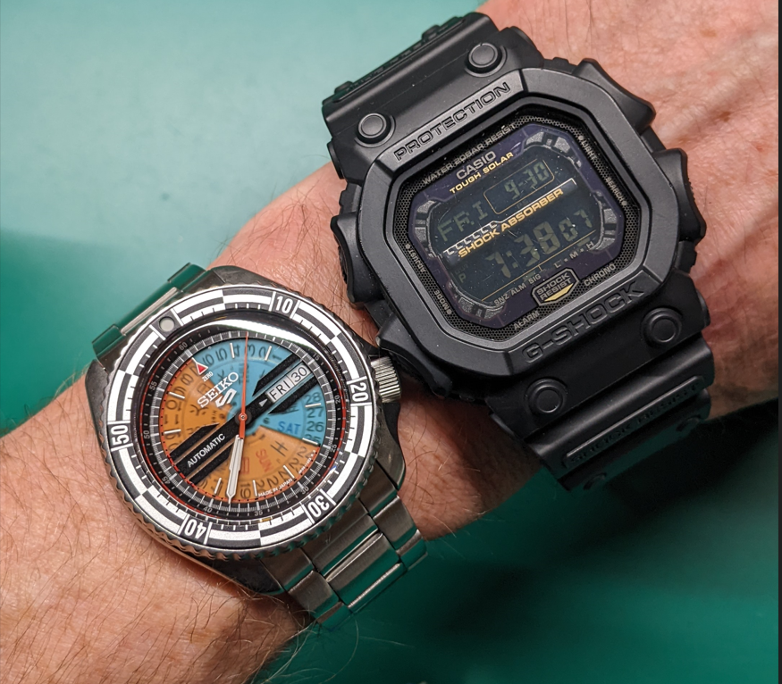
 . It looks right at home next to the Advan calendar watches, what a great photo to drive that point home.


