Tyrone Jenkins
Is a Permanent Fixture
On the day when the wagon's come I just pray that you let me on
Posts: 12,610 
|
Post by Tyrone Jenkins on Apr 5, 2015 17:20:21 GMT -8
How about a change in the Trade Forum rules. Currently 16) No more than five threads may be active at any given time. This count includes all transaction types as well as items inside listings where multiples are offered. Since the trade forum isn't scrolling pages every 24 hours causing newer posts to go off of the first page maybe change the rule to say something like "Only 5 NEW posts per each trade forum (Seiko and Non Seiko)" and to prevent too many BUMP posts maybe only 1 bump for last weeks 5 posts allowed per week? We can certainly look into modifying that rule. Are we still on watch Recon? I posted here and TOF and the ads from TOF show up on there even though I posted here first. If we are not on there maybe we need to lift the limit and get back on there. The additional exposure would draw more traffic and hopefully new members. |
|
|
|
Post by Groundhog66 on Apr 5, 2015 18:41:06 GMT -8
We are still there, not sure why it didn't show up for you. I do see some WS postings on there.
|
|
Deleted
Deleted Member
Posts: 0
|
Post by Deleted on May 15, 2015 2:59:24 GMT -8
Donations button or paypal address please.
|
|
|
|
Post by Groundhog66 on May 22, 2015 20:09:03 GMT -8
Donations button or paypal address please. I appreciate the offer, but our current overhead is pretty low. |
|
Deleted
Deleted Member
Posts: 0
|
Post by Deleted on May 23, 2015 0:22:48 GMT -8
Donations button or paypal address please. I appreciate the offer, but our current overhead is pretty low. Well use the money to get hard to find parts remanufactured  I'd happily give a donation each year towards Wrist Sushi no matter what the overheads. |
|
|
|
Post by meepokta on May 26, 2015 5:36:44 GMT -8
Hi Groundhog66,
When I like a post, the grey thumbsup button changes to a light shade of ... pink or something like that.
I have difficulty telling the pink from the grey (at least on my ipad it's not obvious, might be more obvious from a PC with mouseover).
I can't easily see what I've already like, and so I sometimes unlike a post by mistake.
Maybe it's just my eyesight, but could you configure the thumbsup button to change to something obviously not grey after someone clicks it?
Thanks.
Cheers,
Ronald
|
|
|
|
Post by Groundhog66 on May 26, 2015 5:50:42 GMT -8
Hi Groundhog66, When I like a post, the grey thumbsup button changes to a light shade of ... pink or something like that. I have difficulty telling the pink from the grey (at least on my ipad it's not obvious, might be more obvious from a PC with mouseover). I can't easily see what I've already like, and so I sometimes unlike a post by mistake. Maybe it's just my eyesight, but could you configure the thumbsup button to change to something obviously not grey after someone clicks it? Thanks. Cheers, Ronald I'll see what I can do about that. |
|
Mr.Jones
Needs a Life!
Hamburg, Germany
Posts: 4,679 
|
Post by Mr.Jones on May 26, 2015 6:06:12 GMT -8
One annoying thing I found (and I don't think you can do anything about that) is that sporadically the WS forum sends me to the google play store to install one app or another (on an android tablet, of course). Given that the forum shows you some blurb about allowing ads on the site when you block them, I think this is quite cynic.
Ads I can live with - this trojan horse mentality is getting on my nerves.
|
|
|
|
Post by Groundhog66 on May 26, 2015 6:43:57 GMT -8
One annoying thing I found (and I don't think you can do anything about that) is that sporadically the WS forum sends me to the google play store to install one app or another (on an android tablet, of course). Given that the forum shows you some blurb about allowing ads on the site when you block them, I think this is quite cynic. Ads I can live with - this trojan horse mentality is getting on my nerves. Can't say that I've heard that one before, what browser are you using? |
|
Mr.Jones
Needs a Life!
Hamburg, Germany
Posts: 4,679 
|
Post by Mr.Jones on May 26, 2015 7:00:32 GMT -8
Stock Chrome on Android 5.1.1 - Maybe it's related to a specific ad, because now that I'm trying to get that effect, I don't.  |
|
|
|
Post by Groundhog66 on Jul 13, 2017 9:37:18 GMT -8
Been a while since we've had any suggestions, anyone have anything they would like to add?
|
|
tritto
WS Benefactor
Posts: 5,945 
|
Post by tritto on Jul 13, 2017 15:59:22 GMT -8
A blast from the past. It was interesting to see the genesis of the World Traveller idea.
Personally, I think we have the best little forum on the WWW.
|
|
|
|
Post by 215droc on Jul 13, 2017 16:14:17 GMT -8
Been a while since we've had any suggestions, anyone have anything they would like to add? small thing but would be nice if the Next and Previous could be added to the bottom of the thread pages so you don't have to keep scrolling back to the top when navigating a long thread. |
|
|
|
Post by Groundhog66 on Jul 13, 2017 21:03:35 GMT -8
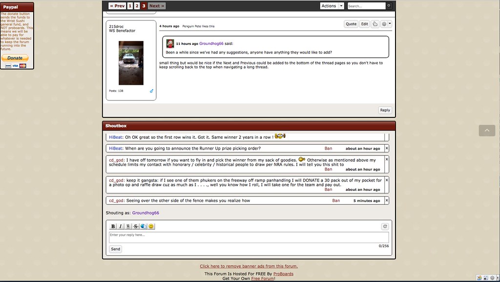
Been a while since we've had any suggestions, anyone have anything they would like to add? small thing but would be nice if the Next and Previous could be added to the bottom of the thread pages so you don't have to keep scrolling back to the top when navigating a long thread. Not sure what you mean, the Previous/Next links follow you as you scroll.....it's right at the top of the window.  Here is a screen shot of me at the bottom of the page.  |
|
Deleted
Deleted Member
Posts: 0
|
Post by Deleted on Jul 13, 2017 21:10:21 GMT -8
small thing but would be nice if the Next and Previous could be added to the bottom of the thread pages so you don't have to keep scrolling back to the top when navigating a long thread. Not sure what you mean, the Previous/Next links follow you as you scroll.....it's right at the top of the window.  Here is a screen shot of me at the bottom of the page.  What 250droc is suggesting is that it would be really nice if the same buttons were placed at the bottom of the page as well. That would save us from having to scroll all the way back up to get to the next or previous page. |
|
|
|
Post by Groundhog66 on Jul 13, 2017 21:38:53 GMT -8
Not sure what you mean, the Previous/Next links follow you as you scroll.....it's right at the top of the window.  Here is a screen shot of me at the bottom of the page.  What 250droc is suggesting is that it would be really nice if the same buttons were placed at the bottom of the page as well. That would save us from having to scroll all the way back up to get to the next or previous page. I'm not sure what you're talking about, you don't have to scroll anywhere, it's a mouse click away right at the top of the page. Those live links follow you as you scroll down, they are always at the top of the page no matter where you are. |
|
pip
WS Benefactor
Berkshire, UK
Posts: 6,185 
|
Post by pip on Jul 13, 2017 22:35:22 GMT -8
I think someone else said it, but could the colour change be more obvious when we hit the like button? And could the buttons be at the bottom of a thread rather than the top? I don't know if I like it until after I've read it.
|
|
Mr.Jones
Needs a Life!
Hamburg, Germany
Posts: 4,679 
|
Post by Mr.Jones on Jul 14, 2017 0:54:29 GMT -8
If you want to have a look at the style sheets:
a.button.likes-button.js-likes-button.liked {
background-color: lightgreen;
}
makes it a minty green
Oh, and if anyone here wants to take action in his own hands - there's an addon for Firefox called "GreaseMonkey" ("TamperMonkey f) which allows custom scripts to run for any website you define.
// ==UserScript==
// @name         Color the "like" button on WristSushi
// @namespace    http://tampermonkey.net/
// @version      0.1
// @description  The active like button on WristSushi is a very pale pink that you can't differntiate from the inactive button. This changes it to a olor of your choice.
// @author       Mr.Jones
// @match        *://wristsushi.proboards.com/*
// @grant GM_addStyle
// ==/UserScript==

(function() {
    // this defines the "active" color of the like button. Try 'yellow', 'lightcoral', 'chartreuse' or whatever tickles your fancy! #ff00ff is fine, too!
    // All color codes: https://www.w3schools.com/colors/colors_names.asp
    var color = 'lightgreen';
    GM_addStyle("a.button.likes-button.js-likes-button.liked {background-color: "+color+" !important;}");
})();
|
|
|
|
Post by 215droc on Jul 14, 2017 4:45:59 GMT -8
Not sure what you mean, the Previous/Next links follow you as you scroll.....it's right at the top of the window.  I can't believe I never noticed that and have been paging back to the top. |
|
|
|
Post by Groundhog66 on Jul 14, 2017 5:35:31 GMT -8
Not sure what you mean, the Previous/Next links follow you as you scroll.....it's right at the top of the window.  I can't believe I never noticed that and have been paging back to the top. Perhaps then you also have not noticed the little arrow to the right of the page as you scroll down. If you click that little up arrow, it automatically shoots you back to the top.....no need to scroll. |
|